

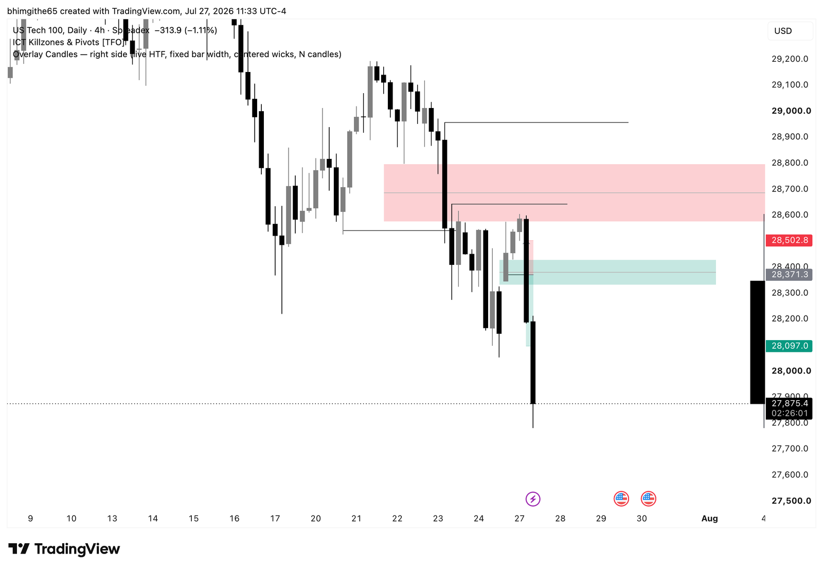
This NDX100 trade journal covers my sell on July 27, 2026 during the New York session. I was looking for continuation, not a new bullish trend. The daily chart was falling, and my note says price rejected a four-hour bullish fair value gap. That rejection supported a sell in the direction I was already watching. I wrote afterward that I should follow my plan and trust the process.
The recorded entry was 28,371.3, the stop was 28,502.8, and the target and exit were 28,097.0. I recorded a win recorded as 2R. These are the completed trade facts; the later movement discussed below is a separate hindsight observation. I am sharing the original screenshots so the reasoning can be checked against the chart, while keeping the written journal as the source for what I actually decided.
Why I considered this NDX100 setup
The four-hour area mattered because a bullish fair value gap did not hold price in this case. If an area that might have supported buyers fails, I have a reason to reconsider the path below it. That is the idea recorded in my journal. It does not mean every failed gap will produce a clean continuation. I still needed an entry and a place where the short idea would be wrong. The original screenshots show the marked zones and decline, but the written reason remains the source for my decision.
4-hour original chart: what it adds
The original four-hour TradingView screenshot is included here, unchanged. It is one of the three charts saved with this journal, not a generated market image. I use it to inspect the marked zones and the surrounding price action alongside my written notes. A screenshot saved after the event can show what happened around a level, but it cannot by itself prove exactly what I knew at entry or when I made each decision. The four-hour image gives context for the failed bullish gap.
15-minute original chart: what it adds
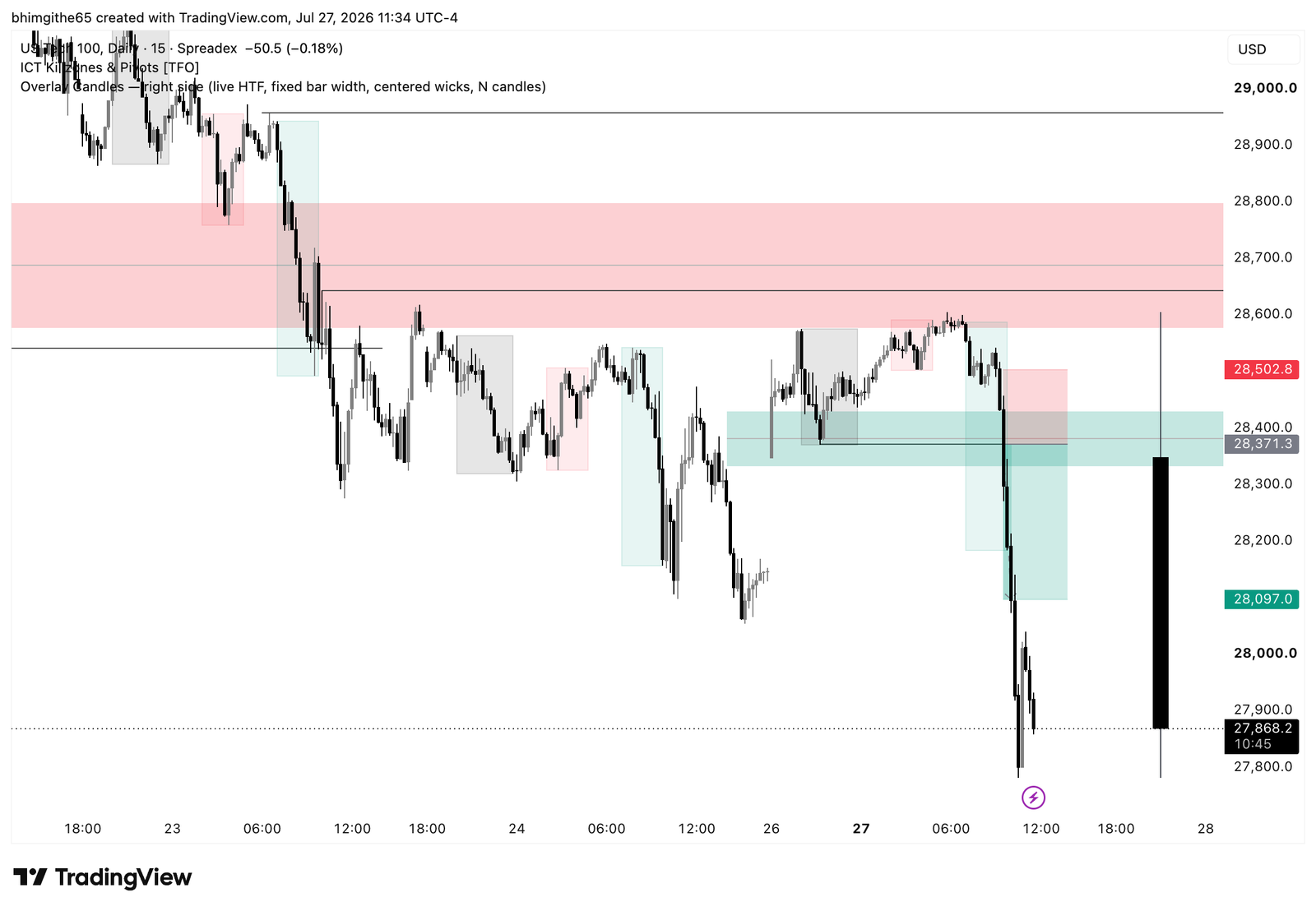
The original 15-minute TradingView screenshot is included here, unchanged. It is one of the three charts saved with this journal, not a generated market image. I use it to inspect the marked zones and the surrounding price action alongside my written notes. A screenshot saved after the event can show what happened around a level, but it cannot by itself prove exactly what I knew at entry or when I made each decision. The 15-minute image shows the continuation within the larger decline.
5-minute original chart: what it adds
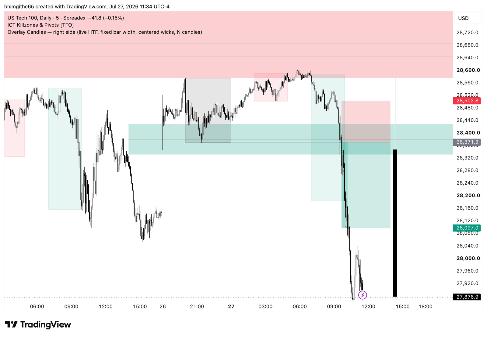
The original five-minute TradingView screenshot is included here, unchanged. It is one of the three charts saved with this journal, not a generated market image. I use it to inspect the marked zones and the surrounding price action alongside my written notes. A screenshot saved after the event can show what happened around a level, but it cannot by itself prove exactly what I knew at entry or when I made each decision. The five-minute image is the closest view of the marked sell position.
Entry, stop and the recorded result
I sold at 28,371.3, put the stop at 28,502.8, and set the target and exit at 28,097.0. The stop distance was 131.5 index points; the recorded move to exit was 274.3 points. Those numbers imply just over 2R before rounding, while my journal records 2R. I describe the outcome as roughly 2R rather than claiming a more precise return than the journal does. I marked the result as a win in the New York session, with confidence before and satisfaction after.
What happened afterward
My later-price note says a 1:3 result might have been available with a different target. I did not record that as the exit. The actual journal fields show a target and close at 28,097.0. Keeping those separate helps me review a trade honestly: I can ask whether the target was too close, but I cannot credit the account with movement that happened outside the recorded position. The chart gives me context for that question, not a second completed trade.
The lesson I am keeping
The lesson I wrote was to follow the plan and trust the process. For me, the process in this entry was recognizing the falling daily context, watching how price behaved at the four-hour bullish gap, and then taking the continuation short. The outcome reinforces the review, but it does not replace it. I want to keep checking the higher-timeframe context and the stop distance before I act, especially when a zone that looked supportive fails to hold.
For my next review, I want to keep the same distinction between setup, execution and result. The entry, stop and exit fields tell me what I actually did. The annotated chart shows the price path I can study later. The lesson field tells me what I wanted to change or repeat. Keeping those three records separate helps me notice a weak process even after a win and a useful decision even after a loss. This is one historical trade, not a prediction about what NDX100 will do next.
Related reading: the free trading journal template I use to keep a consistent record.
This is a retrospective trading journal for education, not a trade recommendation. The featured cover is editorial artwork; the TradingView images are the original screenshots.